
Friday, 8 May 2015
Wall mural in the classroom
So being a senior graduating this year, I wanted to leave my mark on my favourite place in the high school - the art room. So with saying that, I get to paint almost a mural type thing on the wall! So for the past half week I marked off a rectangle, primed it (twice) and today I started my process. I really had no idea at all what I wanted to do so I got some colours ready and I started to mix a magenta with white to form a pink. Just from doing this and making a pastel pink and idea formed in my mind. I would sponge on the wall pastel colours in a sort of pattern and overtop do an intricate black design. Here's from today's work:

Wednesday, 29 April 2015
But Is it Art? Responce
So after reading this post i got really interested in it and i wanted to download an app so i could cube-ify a couple of my posts. Unfortunately there is no such app that has a cubism option!! So instead i had to connect my phone to the computer and do it through that way. So when first looking at this Kubist web application i had no idea whatsoever on what i was doing. I started off by uploading my picture cause that's probably the first step you're supposed to do.
So no after i uploaded it it turned into a bunch of blobs of greyish/black colours. I had to play around with the point/circle/border sizes for a while. I put the picture at 1000 points to make it the most clear it would get. I choose to do the triangle style as it showed the picture a lot more clearer than the cell one did. I didn't know what the circle size exactly was (i do now) so i put it to 5 and i thought there wasn't much of a change. Only when i went to save the picture to make this post did i realize a problem.. THERE WERE WHITE DOTS ALL OVER MY PICTURE! so me being blonde, had to take a couple minutes to figure out that the circle size was indeed the white dots and i put it back down to 0. This is my final product.
In my opinion i don't really like this style of art because its not very clear. I like to see the fine details in art and to be able to recognize what it is. To me i think of cubism like this as a picture someone had taken that would've been an excellent photo, but they moved their arm or something causing it to blur to the extreme.
 |
| This is my cat August |
 |
| cube-ified |
Tuesday, 28 April 2015
Scratch and Mix Project Responce
My first impression of the exhibition was that it is a great thing
to do as it shows the artists' experiments, achievements, their stories and
their challenges. I think by showing all of that through art is powerful way to
convey how the artist feels, as each artist has different styles and
techniques, as well as different pasts and stories. I looked at some of the artist’s
websites that showed their work and I found all of them unique and interesting.
For example, one of the artists named Oluseye has a style where he creates
people in monochromatic colors with almost a geometric look to them. He uses materials
like acrylic paint, pastels, charcoal, wire and graphite pencil on canvas. Overall, his work I find very unique and interesting. Looking at some of the artists' work that were put in links under their description i saw many different types of art. There were photographers, painters, etc. And what was most noticeable was how everyone had their own significant style. The exhibition is a wonderful idea, and the chosen artists' have amazing work that deserve to be shown to the public about their achievements, lives, stories and challenges!
Series in a series
So I have completed the next part of my series. What I did was I
purchased four white canvases and then I researched online why cats always
landed on their feet. This is a unique characteristic that cats have and it
happens almost 98% of the time. I did a couple tests with my own cat to prove
this theory and out of the three times I tried it, he landed on his feet. The
cat righting reflex starts to become effective in cats at the young age of 3-4
weeks old. It has been proven that a cat with a higher drop may have the better
outcome than that of a lower drop. A test was conducted of a cat falling
five floors and a cat falling two floors and the cat that fell from higher
resulted in less injuries. This is because in the longer time of the higher
drop the cat had enough time to re-position itself properly to land without as
many injuries.
Alright back to the actual project now.
After doing the first part of my series I decided I could not only do it on
cats, but a certain cat, my cat. So with the next part of the series I decided
to stick to two colours that go well together but are complete opposites - also
monochromatic. I started looking at the different positions a cat fell in as
they turn from upside down to right side up. Since I had only four canvases i had to decide on four positions of falling. I know i had to incorporate the first and last sequence and then i had to choose two from the middle.


SERIES UPDATE
So I’m pretty much done with my sculpture as I started to get mad
with it. The clay in the box had said that it was air dry-able and that it
wasn't likely to crack. Unfortunately with my luck, it did crack and it
basically ruined the entire design. I tried my best to fill in the crack with
more clay to fill up the space so much it couldn't crack but it wasn't very
successful. Right now I’m at a standstill with that portion of my series and I’m
trying to think of a way to fill in the cracks so that I can paint it and put a
clear coating over top.


So currently while I’m thinking about this
I have started another part of my series which is a series within a series. I
have bought four canvases and I have started to draw the images of cats on
them. What I plan on doing is called the cat righting reflex. This reflex is
when a cat can be falling upside down and he corrects himself mid fall to land
on his feet. The cat rotates its body at the middle on an axis that is
different for both the front and back end of the cat. A cat usually lands like
this with no injury but that isn't the case 100% of the time.
Friday, 17 April 2015
Canadian coin

For this assignment in art is was technically classified as a sketchbook assignment. The point of it was to create a coin that represents Canada. Fortunately but unfortunately, Canada is so huge and diverse, making it difficult to choose just one thing to represent it. I settled on the idea of the land shape because that's one thing that probably won't ever change. I then decided to incorporate a maple leaf as well as it is from the national flag. I know that the map isn't exact and the shapes aren't all correct but at a glance it looks to be Canada's shape.
Thursday, 2 April 2015
Fauvism Art History
Overview
Fauvism- a time period in which it was referred to as a time
where there were plenty of new possibilities for colour in art. This art era happened
in the early 20th century and was out of the ordinary. Created by some French
men, inspired by famous names like Vincent van Gogh, Paul Gauguin,etc.,
grew to be a very popular. The group of men who were well known for using this
type of art style were called the "fauves" -meaning wild beasts. They
were called wild beasts due to the way they used the pallet of colours wildly.
Being part of this art group was almost seen as liberation. The man who led
this group was named Henri Matisse. He and a bunch of other people formed a
group surrounding this unique art form and brought it recognition to this
world. Colour is used at a maximum intensity and the artists usually painted
with the colours that they believed should be there. When first looking at this
style of artwork you tend to think is doesn't follow any guidelines but if you
continue to study it, you realize it uses a lot of visual elements. The main
features this art had were distinctive brush lines, vivid colour, and the
expression of feelings through artists in their paintings.
L'Atelier Rouge (The Red Studio)by Henri Matisse (1911)

This first piece is
one of Henri's most famous pieces he's ever created. My understanding of this
piece is that the artist painted his studio in the colours he saw it in. With
the main colour of red, it colour possibly be showing the motion he felt while
painting it. red. anger? love? happiness? Was he particularly angry that day
with his studio/art? or maybe he could've been totally happy. This painting was
done with oil paint on canvas as that was a typical way for paintings to be at
this time. If you study the picture closer to the painted artworks you can see
possibly inspirations to why he would want to paint this scene. The first thing
you notice would have to be the most important though. As said before, red has
a huge impact on this piece. Where a painter might’ve used black the artist for
some reason used red and made it work. Without the black the painting has a
very different visual effect. Using the same tone throughout, he was still able
to include depth which I find very amazing. At the time of this painting there was
lots of international stress going on, with the war to come in three years.
At
the Circus (The Mad Clown) by Georges
Rouault (1907)
%2C%2B1907.jpg)
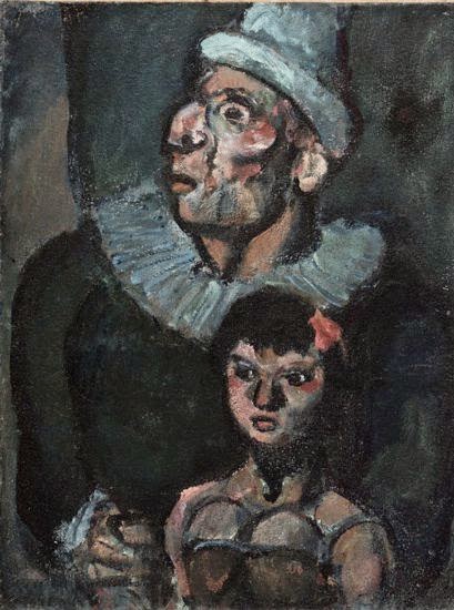
So right away looking at this painting you notice the dark
colour choice. I would assume this under a hidden meaning he painting has with
the two characters in it. So the name of
the artwork “At the Circus (The Mad Clown)” you can pick out the clown character
but it is still unknown who the girl is – viewer or performer? Another question
that comes to mind is why the clown is mad and what his back story is. The
painting is done with oil paints on a piece of cardboard. Cardboard is a very
interesting choice of canvas and it makes you wonder why it was chosen to do
the art on. The painter was a student of Moreau (a very popular artist) and a
friend of Matisse. Two very well-known artists who helped inspire Rouault to
create this painting. The artist was seen as someone in this era to do more
quiet and physiological paintings – paintings with a background. Using some of
the main elements like intense brush strokes and application techniques, he had
a preference to darker colours which echoed ‘human suffering’. As I have
learned, the artist has done multiple paintings of clowns and acrobats off
stage, which is very important to know as a viewer needs to know who the
characters are in a painting. Using psychological inspiration he was always
able to display the characters in full circus makeup but also reveal the deep
sadness within.
Yacht at Le Havre Decorated with Flags by Raoul Dufy (1905)
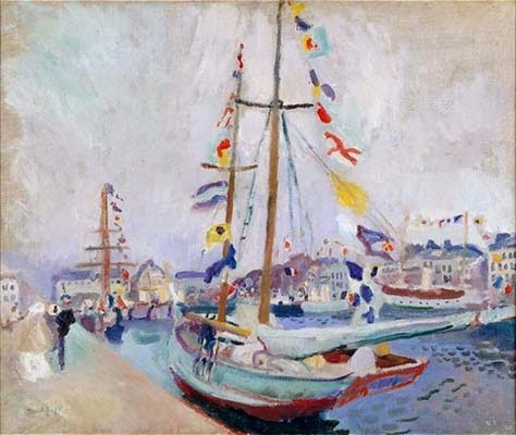
When first glancing at this painting you notice what exactly
is in the picture but that there are no outlines to it. This was a feature of
the fauvism era and I find it to be pretty interesting on how an artist can
have a lack of detail and still are able to form a picture which has lots of
detail. So you can see that in the picture it is a beautiful windy day at the
marina/lake side and that there are many coloured flags attached to the yacht.
The artist Dufy, was very much like popular artists Claude Monet and Eugene
Boudin, painting scenes of one certain place that was his favourite. With the many
different types of strokes the artist used he is able to convey different
textures and effects throughout his work. The artist’s expression through this
painting might’ve been happy as it was a favourite place. Events at this time
were when cars were being factored into cities and horses were becoming less
common. This painting was done on canvas with oil paint.
Subscribe to:
Posts (Atom)